Citicards Marketing Site Redesign
- Role
- Product Designer
- Date
- 2014
- Company
- Citi
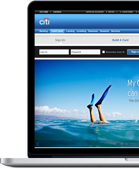
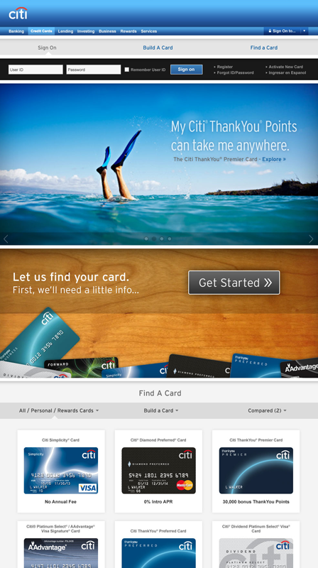
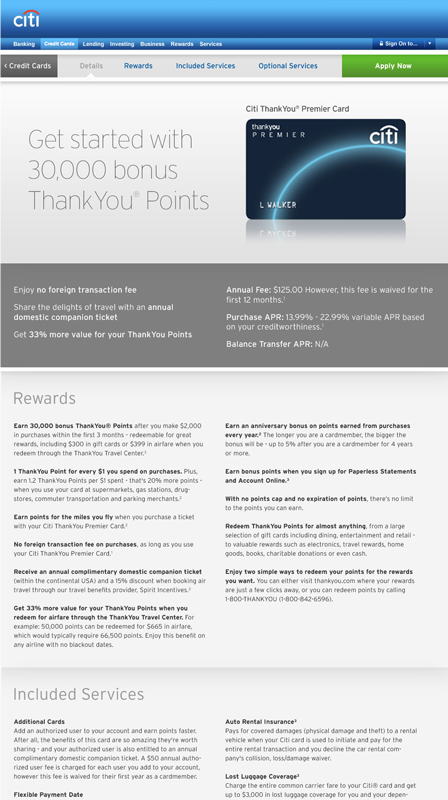
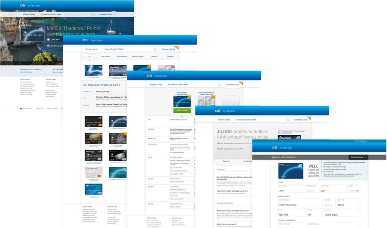
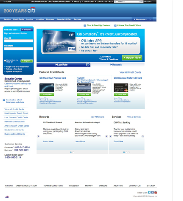
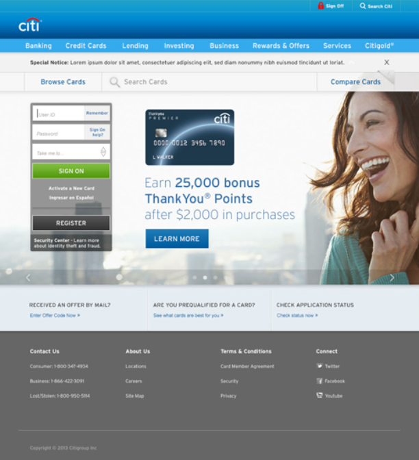
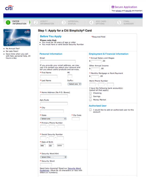
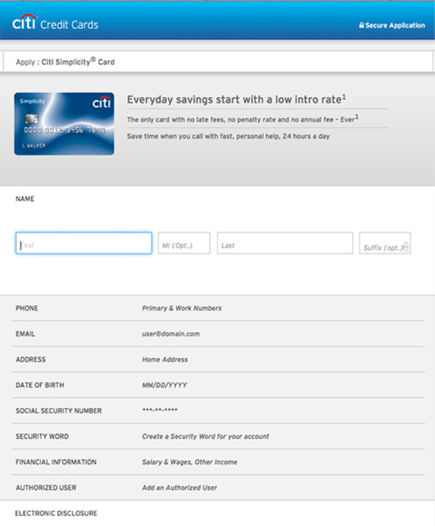
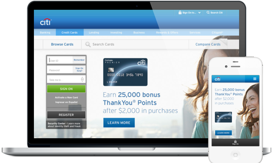
In 2014, Citi set an ambitious goal: double digital credit card acquisitions within a year. As UX Design Lead, I helped redesign the core acquisition experience on citicards.com, including the marketing site and the card application. Our aim was to make it simple, focused and easy to use on any device. Working in a small concepting team and an Agile process, we replaced a cluttered, dated experience with a cleaner, responsive design. The application uses progressive disclosure, inline validation and consistent, plain-language content so applicants can get where they’re going faster.
Double the number of digital credit card acquisitions by the end of the next year.
To help deliver this goal, we recognized the need for a significant refresh (both creative and capabilities) of critical card acquisition experiences, including the marketing site, the application, drive-to-web pages, and the pre-qualification process.
Create a simple, intuitive, and easy-to-use experience.
Redesign citicards.com with a vision of simplicity, focus, driving speed-to-purpose, touch screen accessibility, and personalization.
We started with a small concepting team: a designer, an architect and a copywriter. Together we brainstormed, then built and refined the strongest ideas. We presented the concepts to senior management and then to the Cards business, and validated the direction through usability testing.
Content hadn’t been looked at from a business standpoint in a long time.
Ensure labels, field ghost copy, etc. are consistent across the consumer, business and college applications.
Simplify and tighten copy where possible.
Subtle animation to gently improve the user experience.
Progressively disclosed to reduce UI components to their essence, revealing features as the user needs them.
Form Field ValidationInput guidance and inline error validation.